
Emerald Velocity: A Painting About Movement, Fresh Energy and Direction
Some paintings develop around a color. Others around a feeling of movement. Emerald Velocity started with both.
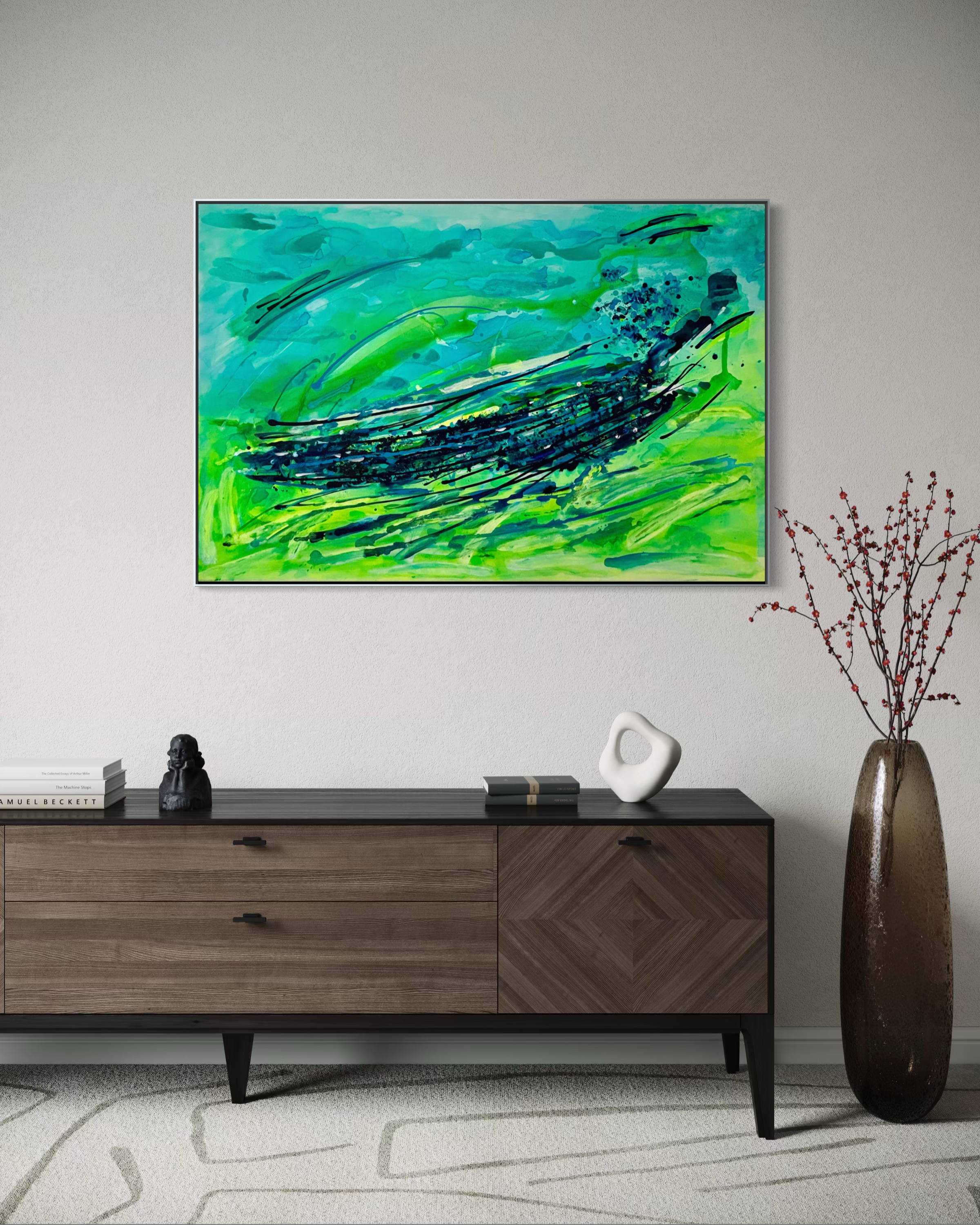
The painting is built around a fresh, energetic palette of turquoise, emerald green, lime and deep navy. These colors immediately create a sense of clarity and openness, but the real character of the work comes from the movement across the canvas. The dark sweeping lines cut through the surface like fast gestures, giving the composition its rhythm and direction.
What I like about this piece is the contrast between flow and control. The background has soft transitions, transparent areas and layered color fields that feel open and atmospheric. On top of that, the darker marks bring structure. They move from left to right, creating a visual current that pulls the eye through the painting.
The title Emerald Velocity reflects exactly that: color and speed. “Emerald” connects to the rich green tones in the work, while “Velocity” describes the forward motion in the composition. It is not a quiet painting, but it is also not loud for the sake of being loud. It has energy, but the energy is directed.
The horizontal format supports this feeling. At 120 x 80 cm, the painting has enough presence to become a focal point in a room, especially above a sofa, sideboard, console or desk. It can bring a fresh accent into neutral interiors, but it also works well in spaces that already use strong materials such as wood, concrete, black metal or natural textiles.
For me, Emerald Velocity has a positive, almost refreshing quality. It feels like movement without pressure. Like a room opening up.
This is what I aim for with Studio Thurm: abstract paintings that bring color, depth and atmosphere into modern spaces without becoming overly decorative. Emerald Velocity is expressive and energetic, but still refined enough to work in contemporary homes and offices.
It is a piece for people who want their space to feel awake, focused and alive.
